NIDO STUDIO
VINOTEKET
MADE BY NETTA
IN BETWEEN
→05 / 07
An identity that makes jazz feel like it was always meant for everyone.
CLIENT
In Between · concept project
SECTOR
Jazz bar & culture
YEAR
2026
SCOPE
Identity · art direction
THE BRIEF
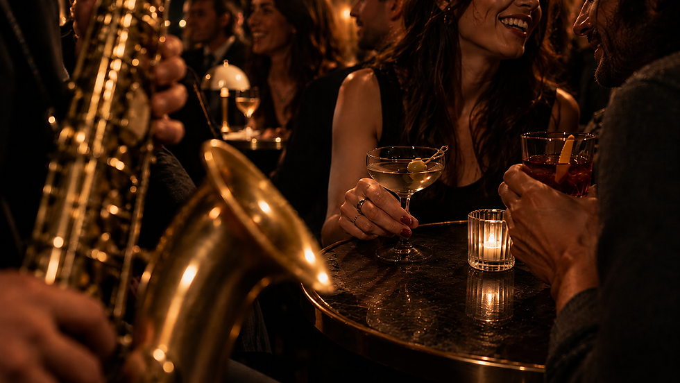
A concept project with one goal: make jazz feel open. Jazz clubs tend to speak to people who already belong, the collectors, the connoisseurs, the ones who know when to clap. In Between had to welcome everyone else too, the young, the curious, the ones who just want a good night, without watering down what makes a jazz bar a jazz bar.
THE IDEA
JAZZ WITHOUT THE VELVET ROPE.
The name carries the whole concept, so the identity lets it play. In between the notes, in between people, in between one drink and the next: the brand lives in the pauses where the good part of a night actually happens. A rounded, groovy logotype tucks the In inside the B, the copy repeats the game on every coaster, and nothing anywhere asks you to prove you know your Coltrane.


THE SYSTEM
How the visual world holds together.
WORDMARK & MARK
A rounded, bubbling logotype with the In nested inside the B, one gesture that reads at neon scale on the street and at sticker scale on a lamppost. On its own, the B swings between a letter and an instrument.
LANGUAGE
The name is also the voice. Magic happens in between, memories happen in between: every surface repeats the game, and the business card wears the words around its edges like a groove. Musica, persone, ritmo, pausa.
ILLUSTRATION
The identity dresses everything that touches a night out: glasses, coasters, posters, caps and tees the staff would actually wear outside their shift. A bar brand that people take home is a bar brand that invites.


