NIDO STUDIO
BONURA
VINOTEKET
COSMIC CURIOSITY
→03 / 07
For people who want to understand the world without a degree to do it.
CLIENT
Cosmic Curiosity · concept project
SECTOR
Editorial · science magazine
YEAR
2026
SCOPE
Editorial design · direction

THE BRIEF
An exercise with one rule: take the hardest science there is and design it so anyone would pick it up. Quantum mechanics does not need to be simplified, it needs to be invited in. The magazine had to do with layout and tone what most science writing fails to do with words.
THE IDEA
SERIOUS SCIENCE, UNSERIOUS TONE.
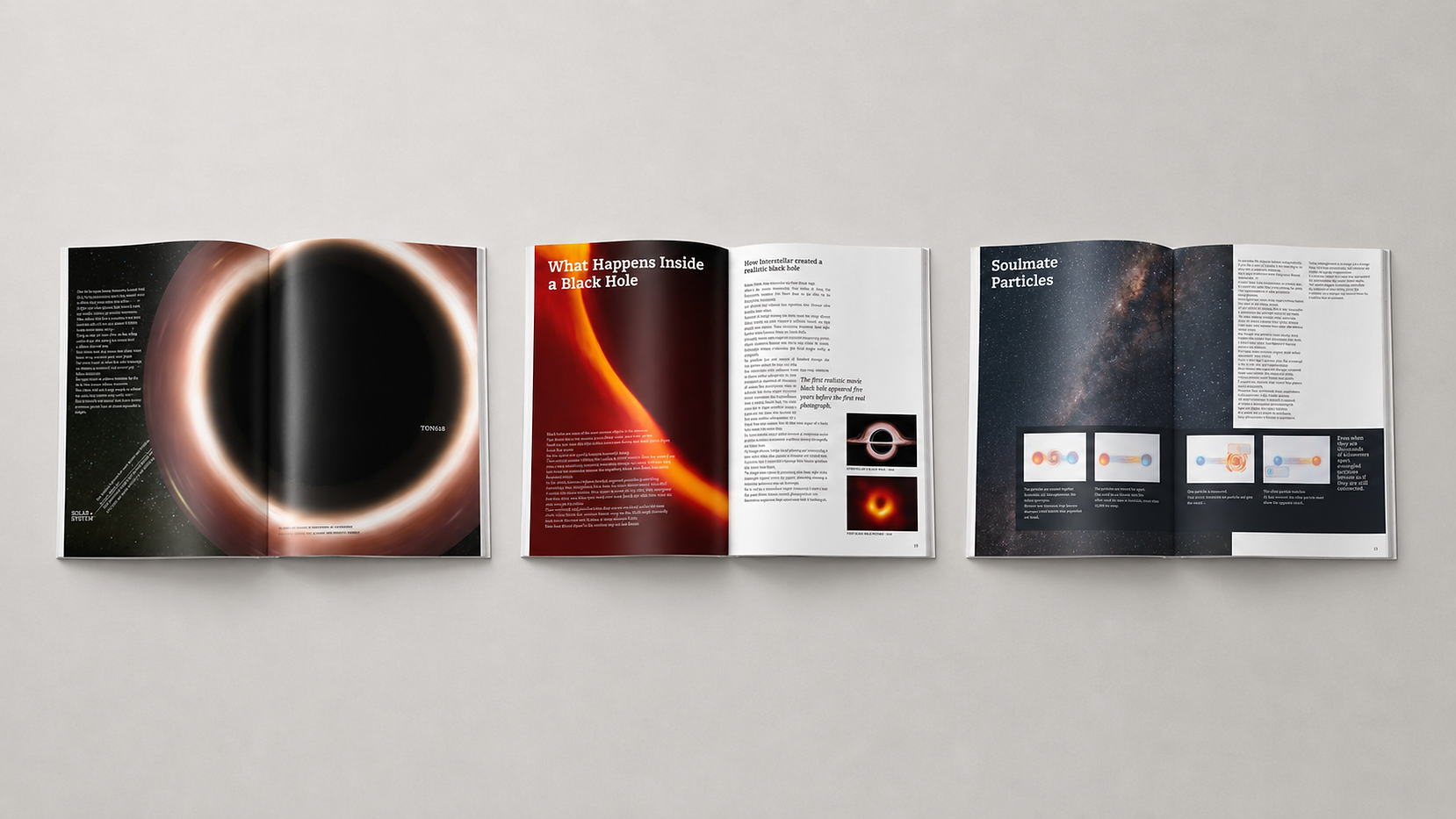
The design lowers the barrier without lowering the content, and then goes one step further: it turns the magazine itself into the experiment. Distances are measured in pages, black holes in spreads, so the reader physically handles the scale that the words describe. The physics stays exact. Only the intimidation is removed.
THE SYSTEM
How the visual world holds together.
TYPOGRAPHY
A warm slab serif does the talking, with italics for the moments that whisper. In the logotype the letters join the subject: the C wraps like an eclipse, the Os are cratered like moons. Even the name is curious.
LAYOUT
The magazine treats its own format as a scientific instrument. The blueberry Moon sits four pages away from its ping pong Earth, TON 618 swallows a spread whole, and a closing note admits that all sizes are in proportion, within the limits of print. The reader does not read the scale of the universe, they hold it.
COVER
A magazine about atoms, fronted by a building shaped like one. The Atomium stands in for the subject, the cover lines promise questions instead of answers, and the barcode plays along as if physics belonged on a newsstand. Which is the whole point.

